Email Template Design Service in Nagpur: Why Your Emails Are Getting Opened But Not Clicked
I once audited a SaaS client's welcome email — great subject line, 42% open rate, and then a 1.8% click-through. The email itself was the problem: a wall of text, no visual hierarchy, and a CTA button buried below three paragraphs nobody was going to read on mobile. We redesigned the template alone — same copy, same offer — and clicks went to 6.3% in the next send.
That's the part most Nagpur businesses miss when they think about email marketing. You can nail your subject line, your list, your timing — and still lose the sale because the email template design itself doesn't do its job.
Why Template Design Matters More Than Most Businesses Think
An email template isn't decoration. It's the layer that decides whether someone reads your message, skims it, or deletes it in two seconds. For businesses in Nagpur competing for attention in a crowded inbox, that first visual impression carries almost as much weight as the offer itself.
Here's what a poorly designed template actually costs you:
- Lower click-through rates, even with strong copy
- Broken or ugly rendering on mobile, where most Indian inboxes are opened first
- Inconsistent branding that makes the business look unprofessional
- Higher unsubscribe rates because the email feels like effort, not value
What a Proper Email Template Design Service Should Actually Deliver
A lot of "template design" out there is just a canned layout from a tool like Mailchimp with a logo dropped in. That's not design — that's a placeholder. Here's what an actual professional service should get right.
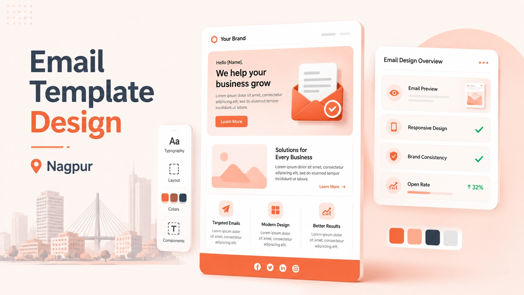
Mobile-First, Not Mobile-Afterthought
Over 70% of email opens for Indian audiences happen on mobile. A template designed on desktop and "checked" on mobile almost always breaks — oversized images, tiny text, buttons too close together to tap. Templates need to be built mobile-first, then scaled up.
Brand-Consistent, Not Generic
Your email should look like it belongs to your business — same colors, fonts, tone as your website — not like it was pulled from a stock template library. This consistency is what builds recognition over repeated sends.
Built for Scannability
Most people don't read emails, they scan them. Clear visual hierarchy — one primary message, one clear CTA, short blocks of text — consistently outperforms dense, text-heavy layouts.
Tested Across Email Clients
Gmail, Outlook, and mobile apps all render HTML emails differently. A template that looks perfect in one and breaks in another is a design that wasn't properly tested — this is one of the most common gaps in DIY templates.
DIY Template Builders vs. a Professional Design Service
Tools like Mailchimp, Klaviyo, and Brevo all offer drag-and-drop template builders, and for very early-stage businesses they're a fine starting point. But once you're sending regularly to a real list, the gap becomes obvious — generic templates don't reflect your brand, don't account for how your specific audience reads email, and rarely get properly tested across devices and clients.
A working web dev agency client I supported ran their own templates for over a year before switching to a designed system — their average CTR nearly doubled within the first two redesigned campaigns, with no change to their list or offer.
Common Mistakes Businesses in Nagpur Make With Email Templates
- Using one generic template for every email — welcome, promo, and newsletter all need different structures
- Overloading with images that slow load time and get blocked by default in many inboxes
- No clear single CTA — multiple competing buttons confuse the reader and reduce clicks on all of them
- Ignoring dark mode rendering, which distorts colors and logos on a growing share of inboxes
- Copy-pasting from Word or Canva into email tools, which breaks formatting and creates inconsistent rendering
Quick Action Items
- Check your last 3 sent emails on mobile — note anything that looks broken or cramped
- Make sure every template has one clear, single CTA above the fold
- Test your current template in both light and dark mode
- Standardize your brand colors and fonts across every template you send
- If your CTR has been flat for 3+ months despite good subject lines, the template — not the copy — is worth auditing first
Good email template design isn't about making things look pretty. It's about removing every bit of friction between someone opening your email and taking the action you want. Get that right, and the same list you already have starts converting harder.
Need email templates that are actually designed to convert — not just look nice?
See Our Template Design Service Book a Free ConsultationFAQs
How much does professional email template design cost in Nagpur?
It depends on complexity and whether you need a single template or a full system (welcome series, promotions, newsletters). A custom, tested template system typically costs more upfront than a drag-and-drop builder but pays back through higher click-through and conversion rates.
Can't I just use Mailchimp or Canva templates instead of hiring a designer?
You can, and it's fine when you're just starting out. But generic builders often break on mobile, don't match your brand precisely, and aren't tested across email clients — issues that become expensive once you're sending to a larger, more valuable list.
How long does it take to design a custom email template?
A single well-tested template typically takes a few days to a week, depending on revisions. A full template system (multiple email types) takes longer but only needs to be built once and reused.
Do email templates need to be different for mobile and desktop?
They should be built mobile-first and then scale up, since the majority of opens happen on mobile. A template that only works on desktop will underperform for most Indian audiences.
What's the biggest sign my current email template needs a redesign?
Strong open rates paired with weak click-through rates almost always point to the template, not the subject line or offer, as the problem.